Once again I apologize for the seemingly lack of updates. A lot has been happening the past few days, and I haven’t really gotten the time to sit down and blog—a cousin came to visit from Canada, my sister celebrated her 21st birthday, a new template for Kutitots is underway, and Marc decided it was time to do some very minor (but work-intrusive) renovations on our house. So yeah, I probably won’t blog if I wasn’t requested to. Heh.
The following is a paid review through ReviewMe for CardroomSupply.

I wasn’t really planning to take this review. I thought I had to review some Poker product, and between you and me, I’m not a gambling person. Though a few of my cousins play this game (without actual money involved), I honestly have no idea how it works. Good thing that the review requested of me is of the site’s design, and not of the products.
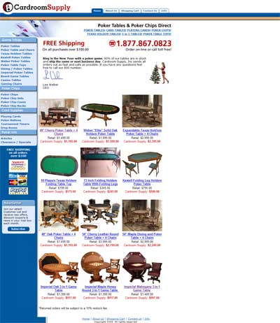
It’s a good thing that CardroomSupply is planning to do a redesign, because really, I’m so not “feeling†the site, if you know what I mean. I suppose it’s because of my advertising background—I insist on a web design interpretation of a company’s identity, which I believe (and have been taught) gives a more effective marketing presence for any brand.
Before I go into specifics, this lack of brand representation is the main thing that bugs me about the design. It’s too generic—kind of like something you pulled off a template site under the general design category and just plugged in the logo on top (mind you, there are actually better templates out there that were made specifically for poker products). Those designs are applicable to sites selling a variety of products and don’t focus on a specific line.
Frankly, the current design bears an uncanny similarity to the default osCommerce template. It seems like it was just changed a bit but not really (kind of like the gazillion of WordPress templates out there that are practically just Kubric clones with a slight twist). Believe me, there are ways to go around the limitation of a shopping cart system. Take a look at some of the cart designs I’ve made for SheeroMedia (Pointe East Imports and TSS Products—I did the design, but not the integration to the system). They’re running on osCommerce systems but they won’t remind you too much of the default template. Even if you don’t have a great programmer to integrate the design into the system, there are still ways to go about it using CSS.
The color scheme matches the logo’s colors, but there just isn’t anything on the design that will tell the visitor, “this is a site where you can buy poker products.†It really lacks the “poker feel.†A remedy I can think of is fusing green into the color scheme. As I have said, I’m not a poker player. But for some reason, green reminds me of poker. Probably because the top of poker tables is usually green (think Casino Royale).
It’s always best to play with the general perception of the product line. After all, the objective of the site is to make people buy the products. Giving the site a design feel that will remind them of poker adds to credibility—you know your products, and you know your customers. Generic designs for specific product lines usually make me doubt if the company is trustworthy: Joe Schmoe buys a domain, got hosting, and plugged in some cart system where products are just bogus. If I see that the company actually took the time to make the design right, I’m more inclined to trust them. After all, they did pay extra for an effective site design and enjoyable viewing experience.
The horizontal navigation is actually good—it’s organized and saves space, as well as puts emphasis without interfering with the product categories. But if it was up to me, I’d prefer to have the navigation below the logo in order to put more emphasis on the brand. I don’t really like the brown textured bar, but if it’s beside a touch of green color, I think it would be ok.
This is the part I particularly like about the site:

The area highlights the important actions that you want your visitor to do: buy the products, call for inquiries, and gets them enticed with the offer of free shipping. I specifically like the emphasis on the important words—this is an effective advertising strategy. The proportion of text size and red color make these important marketing words stand out.
I honestly don’t like the side navigation bar much. The placement is good (I myself prefer to have a rundown of product categories on the side for usability purposes), but the design is just a bit off. There isn’t enough room for the text to “breatheâ€â€”the text seems to be squashed to the left end of the screen. The main product categories (which I think is very important), just don’t stand out. White on light blue is not a good way to emphasis things; the color contrast is wrong. It’s better to just make the text some darker shade of red if you’d really intend to stick with the light blue scheme.
If I were given access to the site’s FTP, I think I would really pay some attention on the footer as well—but that’s the problem of their designer hehe. The footer navigation is a good idea (gives the visitor a way to navigate the site even if they’re at the bottom of the page without having to scroll all the way up), but I don’t think much attention was given to the coding of the footer—there’s this ugly indentation of the background. I may be a bit obsessive-compulsive on things like this, but come on. You’re getting paid to design a site, you might as well get the job done right.

Just a few more recommendations before I wrap this incredibly long review entry. Put a search bar on the site. When you have a lot of products, this is imperative. If people have a hard time looking for a particular product, they’ll just give up and leave your site—unless they are totally desperate and have no other alternative, there are very few who would stick around and try to find a product manually by going through each and every category.
And lastly, put the newsletter signup somewhere a bit more visible. The newsletter is a way to gather emails, and solicit advertising without spamming. If you’d really like to make use of this marketing strategy, it’s better to have the newsletter box somewhere on the page that people won’t easily ignore.
Oh, by the way, I like the individual product pages. Just spice it up a bit, and you’re good to go.
NOTE: I viewed the site using Firefox, Internet Explorer and Opera at 1280 x 1024 screen resolution on PC for this review. Sorry, I don’t own a Mac 😛
Need a new website design? Get the help and great service you need with a professional website designer. Find great tips and ideas by searching web design portfolios. Find what you are looking for with the help of a web design company in your area. By reviewing web design resource sites you can learn important information for your personal site.


I agree that branding should by top priority. Plus, there’s too much white space on the right side of the screen.
I think the site looks too much of a template, plus the pics used could have been more cohesive/consistent with one another. I like the navigation, it’s well-organized.