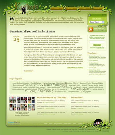
I make sure to redesign this blog at least once a year. I try as much as possible to release the new design on the 14th of February, Valentine’s Day and my blog’s anniversary. It usually depends on how busy I am at work, and this year’s design launch is worst ever: I’m more than five months delayed 😛
But… Here it is. The 10th redesign of Kutitots.Com since 2003. I’m frankly not very pleased with it. Not trying to be modest, but really, there’s nothing special about it. I was just getting too tired of the ads cluttered around my blog. I still care about monetizing Kutitots, but no longer at the expense of my design.
I’m a part-time pro-blogger, but I will always be a full-time web designer.
I guess that’s why I entitled this design version, “Kutitots Refresh.” I needed a design refresh 😛 There were just so much clutter in the previous design, and frankly, clutter like that makes me quite uncomfortable. I’m just obsessive that way—mess in my work area somehow makes me lose interest doing whatever I needed to do unless I clear it up.

As I said, there’s nothing really special about this version, just a clean-up of the previous design’s clutter. I’m not entirely satisfied with it, so I’d probably replace this soon and break my tradition of changing designs only once in a year. For now, just think of this as a “transitional” layout till I come up with a better one.
There are some things I haven’t finished skinning yet for this design:
- Ordered lists (the setup of the previous design’s ordered list is pretty complicated, so I’ll probably fix this last)
- Unordered lists (as you can see, the list you’re seeing now sucks. It’s like, FUGLY)
- Page numbers on the home page and archive pages (it’s in its default blue scheme right now, and that totally clashes with my green theme)
- Missing pages: Links and Blog Archive (Photos will be a link to my gallery, which I am YET to set up hehehe)


I actually like the design. I love green! I’ve been hoping I could do the stems trick for years now. I wonder what your previous designs looks like.
About satisfaction, I haven’t satisfied myself either. I can always find something to change/enhance. Looking forward to your next design.
Hi!
I’m just your fan.
I just want to learn something or maybe a lot from you.
I’m currently employed as a Med Tech and working voluntarily with the Philippine Volleyball Federation as Graphic designer. I made the new logo. Hope you love volleyball too!
I attended the wordcamp yesterday where ive seen you for the first time. I know you through spikeithard.com.
I used to maintain PVF’s website but since the federation need money to maintain you know we stop that.
This coming October, there will be a big event in volleyball world. The 7th asian youth girls volleyball champ, 12 asian countries at PhilSports Arena.
Since i’ve learned little from wordcamp, and was so unlucky kasi hindi ko napakingan lecture mo. magulo po kasi yung wordcamp. Napunta ako sa american and kulang sa demo lecture niya.
Now, one of our coach gave a domain for PVF, I just need ideas from you. I am using flash, dreamweaver & adobephotoshop.
Thank you!