No, my blog hasn’t turned into a review site yet. It so happened that the two were sent almost one after the other. I’ve been a pretty lazy blogger lately anyway—I really don’t know what to make of the Kutitots redesign (well, there goes the bloggies!). I’ve been planning to enter the new design in the 2007 bloggies, but the deadline is already tomorrow so forget it.
The following is a paid review through ReviewMe for Traveler’s Joy.
Maybe I’m a bit biased when it comes to the light blue and orange color scheme, but design-wise, I can honestly say that they did a good job. The soft tones set the “vacation mood,†making you really look forward to your honeymoon. Since in the design of the site is already good, I decided to focus on its functionality.
I was a bride myself about a month and a half ago, but I never really experienced signing up for gift registries. My job dictated that I stayed at home (my work is home-based), so I didn’t really have the luxury of going out and signing up for registries at the mall. I don’t know why, but most (if not all) registries here in the Philippines require both the couple to be physically present at the shop to sign up.
Luckily, the site owner allowed me to create a sample account in order to test the site for my review.
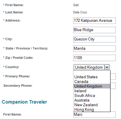
The error-checking is good—the page generates an error page in case the user fails to fill up fields marked by an asterisk. The system also seems to recognize past dates. But the thing is, I was able to put in bogus info. Take this screenshot as an example:

The address part is “forgivable,†but the City, Zip Code and State are not. I know that it is possible to use PHP and Javascript to create a Country dropdown menu that will dictate the City, State, and Zip Code limitations and specifics. They only have eight countries as selections anyway. So why not go a tad bit further into making code that will do that? If one selects “United States,†they’ll select from a State dropdown then from there, the City within the chosen state. The zip code follows. If they didn’t select US and chose a country that doesn’t have a state, the State menu will be grayed out. This sounds a bit complicated, but in terms of gathering accurate data from the members, it will really help a lot.
Another thing I didn’t like in the sign up is that after I successfully complete Step 1 (Enter traveler information) and hit the Back button, the information I inputted was gone—it didn’t have a cache. I was really annoyed when that happened, to tell you the truth. Although I did hit the Back button on purpose, I was still pretty miffed at the fact that everything I typed was gone. It’s always better to assume that the visitor will be an idiot, at least you can be assured that you have everything covered (a smart person would be able to figure out that he shouldn’t hit the Back button, but the idiot will not).
“Idiocy†is not only the thing to consider about caching information—it’s for the convenience of the user too. Imagine having to retype the same info all over again. Unless you really wanted to sign up (like, you’re really bent on signing up), you’d just forget about it and move on.
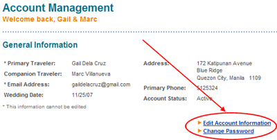
I actually took some time figuring out how to change the “Goal Limit†of my account. As it turned out, I have to be on the main Account Management page in order to see the miniscule “Edit Account Information†link somewhere on the page.

Editing the account information should be one of the most important functions of the system, because it basically controls the member’s identity on the system. A miniscule link like that would be unnoticed—it should be more prominent.
The Registry Page landing area actually fairs better in terms of usability. You just need to click on the areas you’d like to edit—it’s idiot-proof. The thing that irks me about this though is the View Registry Page button. For one, the opening on a new window is irritating (lucky I use Firefox). And when I’m on that page, there’s no way I can edit the info even if I’m logged on. It should always be easy for the user to update the info (even from the actual Registry page). Even Friendster and Multiply have this easy-to-edit feature.
The upload photo function seems to work ok (well, at least I didn’t have any problems accessing it), but I would really suggest that they take a good look at the HTML “codes†on the text area. Ok, so they only allow limited codes. But the thing is, their instructions are a bit confusing. I tried using the all the available codes, they seem to work fine except for the ‹bullet› code. It said on the instruction sheet that the ‹bullet› code doesn’t need to be closed. But the truth is, it SHOULDN’T be closed. Else, you’d get a nasty “‹/bullet›â€ on your text like this:

Before I wrap this up, I’ll discuss first the two major things that irked me about the site: the very long URL provided for the members’ Registry Page and the tables everywhere.
The long URL, I’m not sure I even have to explain. It’s just too long, it’s hard to remember. And I’m not just being a nit-picker here. The longer the URL, the possibility of mistyping it goes higher.
On tables… Well, the design’s Web 2.0 (with the gradients and big texts and all that), why not go all the way? I myself have been trying to do away with tables as much as possible (because tables are for data, not layout). Besides, “DIVed†sites are friendlier to search engines than those made with tables.
I’m guessing from the site that Traveler’s Joy just launched, and there definitely is room for improvement. I would really suggest that they consider allowing the customization of the pages—kind of like Friendster and Multiply. Sounds tacky, but most often than not, couples like personalizing their wedding stuff (trust me, I was just a bride myself and I even run a small novelty invitations business).
Another thing they might want to consider is to allow couples from the Philippines to create registries (not like the bogus one I created). From what I understand in the process, once a gift is “fulfilled,†the couple will be able to request a check after 72 hours. For the delivery methods of gift redemption, take a look:

They have Air Letter Post and Wire Transfer, the very same methods that we use here in the Philippines. So that means receiving is no problem. If a Filipino couple has relatives abroad and they’d like to have a honeymoon registry instead of the “stuff†registry that they usually get, this will be very convenient. But don’t count out the Filipino guests who’d like to give them gifts through the registry yet. Paypal here in the Philippines may not allow requesting for money, but the limited access they give the Philippines do allow sending money using US-accepted credit cards 🙂


ReviewMe never paid me:
http://bloggingpoet.squarespace.com/bloggingpoetcom/2007/1/5/reviewmecom-still-in-arrears.html
Gail,
Thank you for your thoughtful insight in regard to the functionality of our website. I’m actually a bit delighted you took the direction you did in focusing the comments on the actual function of the site rather than the service itself, of which we have many similar reviews. It’s great to read some critiques such as these from an obviously talented designer such as yourself. If I could, I’d like to comment on a few of your points:
1) In regard to the address error checking, I know there are some scripts available which will error check the zip code to the country and we did look at them and even have some running in our sandbox environment. We only recently opened the site up to other countries. The address fields were intentionally left a bit more open because a) based on our testing we weren’t 100% that the error check scripts were totally accurate (false errors) b) we wanted to get the site open to the other countries as soon as possible (this was obviously a business decision) and c) members cannot receive their gift funds if their address is incorrect, providing a strong incentive for them to check themselves. As we get more and more international members, we will probably revisit this error checking issue, but it has never been a problem to this point.
2) I’ll ask our programmer to add a cache for the registration page. You are correct, it is annoying to lose your data. On some other multiple step forms in the site (like giving a gift), we have a “return to step #1” type of links which retains the information that has already been entered, but even on those pages, I believe hitting the “back” button instead of the link will still cause previous data to be lost (with a warning from the web browser). I’ll have someone look into this.
3) I agree the link for editing one’s account could be a bit more prominent, but members very rarely change this info once they have registered (based on page visit stats). I’ll look into improving the visibility of that link regardless. I think you make a good point even if it only affects a small percentage.
4) I’ll update our HTML code instructions with your suggestion in regard to the bullet tag. That’s a great find and could certainly be confusing.
5) I agree that the custom URLs we provide are long. Most gift givers, however, either follow a direct link from an emailed registry notice or come to the main page and search for the couple they want to give a gift to. We are looking at the possibility of providing custom domains for our members ( e.g. http://www.timandsheila.com) and perhaps more enhanced features to create a more full-featured wedding home page, but probably not until later this year or early next.
6) We were established in 2004 and have been running live since the end of that year/beginning of 2005. While we have added many features to the site, the basic underlying code structure has not really changed. I agree that the pages can be too table heavy and should incorporate a more updated and standards friendly structure. It definitely been near the top of my to do list for some time now!
7) We are always looking to open our service to other countries. I can’t say we have any definitive plans for the Philippines at this point, but I would not rule it out for the future.
Again, thank you for your thoughtful comments. I hope I was able to clear up a bit about our thought process in regard to a few of your points.
All the Best,
Tony Alexander
Co-Founder and COO
Traveler’s Joy Inc.
Thank You